The Problem
Patients needed a better way to choose a doctor. For low acuity care like primary care (aka family medicine, urgent care, internal medicine) the most important factor is often convenience. Where can I get in the quickest, what is nearby and what works with my schedule. For more specialized care such as treatment for a rare disease someone is willing to travel farther to get the best care possible. Listing out locations wasn’t enough because people wanted to see what doctors where at locations near them. Additionally our secondary audience of referring physicians or someone that was told about a doctor by name wanted to search by name. In other cases patients have a specific area of need like a less common disease and want a doctor who specializes in that area.
The Solution
We didn’t want our solution to take up a big chunk of space on the page. Our audience generally wanted to learn first and then decide on a doctor. Additionally some people don’t care who they get and just want to be assigned a doctor.
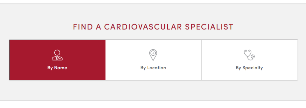
We created a minimal tabbed feature that we called the find something tool, it helps people find doctors by name, location information and specialties. It minimizes the location information as well as the doctor information until someone is ready to engage with it.

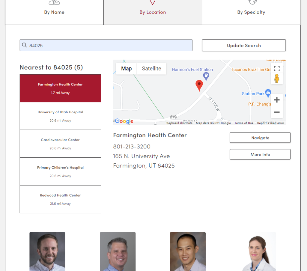
Once a tab is selected additional guided choices popup, the by name tab allows for searching alphabetically or by typing in a specific name. the by location tab allows for entering a zip code and seeing what is closest. Once a location is selected doctors are listed at that location. The by specialty tab is placed last because the specialty is usually the last thing people look by since they are already on a fairly specific disease or treatment page. The by specialty tab lists the various sub disciplines of the doctors related to the disease or treatment.

To pull this all together I worked with our designers to mockup and prototype ideas then I worked with the developers to combine location data from a master location list and doctors based on matching locations.
The Outcome
The component created a consistent way for us to handle several problems. Reduced our developer load once built and increased the usability of the site. We measured interactions with the various tabs, watched session recordings and ran user testing and interviews showing the tool worked as intended. Reducing the cognitive load, getting out of the way until someone was at the stage of needing to choose a doctor or location.
Problems to fix
Often there are only 2-3 locations, why make people enter a zip code when it changes little. Its less work for the customer to see those locations by default and not have to enter in data. Our developer tried displaying all by default and user the browser location as the default zip code but this sky rocketed our bill with the API we used to calculate distances. I asked to not calculate distance until zip entered but we are in the middle of another massive project and the changes had to be simple due to limited capacity at the moment. We had to back out the display of all locations by default when less then 3 but will rebuild this in our new platform.