The Problem
In 2021 the great resignation, (a phrase that might be better described as a reshuffling), had a major impact on our scheduling call center. Marketing had delayed and paused campaigns to handle the influx of covid patients but in the summer things had started to turn around and campaigns were green lighted. Unfortunately the call center was understaffed and our paid campaigns were generated increasing loads. This came to a head when the director of care navigation called and pleaded with me to help find a solution. Can you remove the phone numbers from the website? Can you reduce the forms being summitted? These were all KPI’s for my team and something I never guessed we would be asked to reduce. I recognized that the customer experience was suffering if we couldn’t answer the calls or respond to there request for appointments.
The Solution
I learned from our care navigation team that the biggest bulk of calls was coming from primary care. On the primary care websites our most prominent and obvious CTA’s were to call or schedule an appointment. These could be on a location page like farmington or a service line page talking about primary care. Fortunately primary care offered online scheduling for most services so if we could direct people to online scheduling they could self select there appointment time and location without having to go through the call center. We couldn’t completely eliminate the phone number because a few services were not available through open scheduling, we also still need to leave the phone number for those that just prefer to talk with someone. After someone clicks on the CTA to schedule an appointment we then need to determine what kind of appointment to send them to give them the right scheduling options.
A look at the desktop vs. mobile design
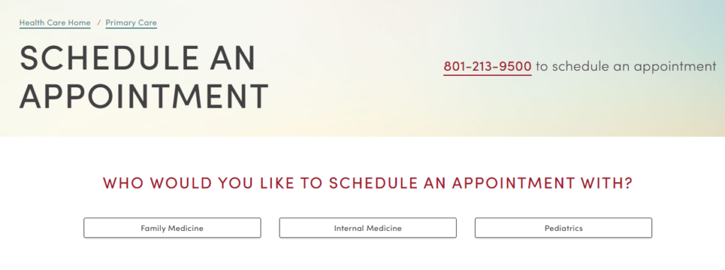
There are a number of entry points to schedule an appointment. For primary care those might be from a location page or from a general service page. Once someone clicked on a schedule an appointment button they were taken to a secondary page asking what kind of appointment. From a desktop the design we were highlighting the scheduling choices, although the phone cta was still prominent.

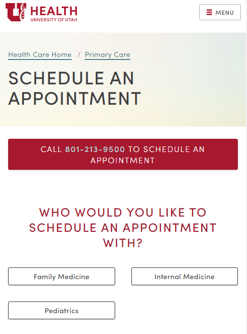
From mobile which was 70% of our traffic when someone clicked schedule an appointment it was much worse. Depending on screen size sometimes all people would see after the initial page to schedule an appointment was another page with a big red button at the top to call to schedule. YIKES! A little design work and we could solve for this problem.

The new version
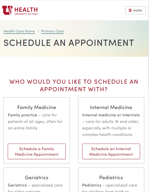
In the new version on the scheduling page I had our team removed the phone number from the top, additionally we explained what the different choices are since few people know the difference between internal medicine and family medicine. We left a phone number at the bottom after people saw there choices so they could still call if they wanted or if the service wasn’t available that they needed.

We completely eliminated the form since it just generated an email that sat in a que with our call center to handle when they were slow. This wasn’t happening so no one was getting call back from the form. AKA bad experience for our customer.
The Outcomes
Comparing 5 weeks before and 5 weeks after the change we saw that despite pageviews being down due to reduced campaign spend we saw increases in open scheduling and significant decreases in phone calls.
Analytics from a few sites on our scheduling pages where the design changes were made.
Farmington – Page views were down by 22% but open scheduling was only down by 1% while mobile calls dropped by 59%
Centerville – Page views were down by 10% but open scheduling was unchanged and mobile while mobile calls dropped by 28%
Sugarhouse – Pageviews were down by 2% but open scheduling was up by 9% and mobile calls went down by 13%
Primary Care Service – Pageviews were down by 10% but open scheduling was up by 3% and mobile calls went down by 58%
Lessons Learned
What went well for us in this situation is that I had a good relationship with the Sr. Director for care navigation. I recognized that she and I had very similar roles but for different channels. I was responsible for the online experience which included helping people find the right doctor and make an appointment. Her team did the same but through a phone call. We recognized our similarities and had worked on a number of problems together. Because of that relationship she knew she could reach out to me and help her solve there problems.
If a businesses capacity is strained KPI’s don’t always equal value for the user or business. In this case measuring our goal for generating phone calls and form submissions was increasing strain and reducing the businesses capacity to handle higher margin services. The customer was stuck on hold having a bad experience or possibly hanging up. Customers should have a better experience self selecting there time for an appointment while the operational costs for the business for that customer went down. You should keep an eye on business constraints as well as weight your kpi’s toward those that improve both customer and business value.
Ideally we would do some rapid prototype testing on the changes before they went to product but the urgency of the problem and the clearness of the solution led us jump directly to change without testing. Try to catch the problems earlier so you have a little time for testing. The data unlikely wont tell you the problem but talking to various stakeholders including operational touchpoints will.
Follow the signals all the way through to conversion, understand the customer perspective and business perspective. Often you can find alignment in both and that’s where magic happens.
In another post I talk about following the user all the way through the conversion. Sometimes even a conversion isn’t a conversion.